One of the biggest challenges an SEO faces is one of focus. We live in a world of data with disparate tools that do various things well, and others, not so well. We have data coming out of our eyeballs, but how to refine large data to something meaningful. In this post, I mix new with old to create a tool that has value for something, we as SEOs, do all the time. Keyword grouping and change review. We will leverage a little known algorithm, called the Apriori Algorithm, along with BERT, to produce a useful workflow for understanding your organic visibility at thirty thousand feet.
What is the Apriori algorithm
The Apriori algorithm was proposed by RakeshAgrawal and RamakrishnanSrikant in 2004. It was essentially designed as a fast algorithm used on large databases, to find association/commonalities between component parts of rows of data, called transactions. A large e-commerce shop, for example, may use this algorithm to find products that are often purchased together, so that they can show associated products when another product in the set is purchased.
I discovered this algorithm a few years ago, from this article, and immediately saw a connection to helping find unique pattern sets in large groups of keywords. We have since moved to more semantically-driven matching technologies, as opposed to term-driven, but this is still an algorithm that I often come back to as a first pass through large sets of query data.
| Transactions | ||||
| 1 | technical | seo | ||
| 2 | technical | seo | agency | |
| 3 | seo | agency | ||
| 4 | technical | agency | ||
| 5 | locomotive | seo | agency | |
| 6 | locomotive | agency |
Below, I used the article by Annalyn Ng, as inspiration to rewrite the definitions for the parameters that the Apriori algorithm supports, because I thought it was originally done in an intuitive way. I pivoted the definitions to relate to queries, instead of supermarket transactions.
Support
Support is a measurement of how popular a term or term set is. In the table above, we have six separate tokenized queries. The support for “technical” is 3 out of 6 of the queries, or 50%. Similarly, “technical, seo” has a support of 33%, being in 2 out of 6 of the queries.
Confidence
Confidence shows how likely terms are to appear together in a query. It is written as {X->Y}. It is simply calculated by dividing the support for {term 1 and term 2} by the support for {term 1}. In the above example, the confidence of {technical->seo} is 33%/50% or 66%.
Lift
Lift is similar to confidence but solves a problem in that really common terms may artificially inflate confidence scores when calculated based on the likelihood that they appear with other terms simply based on their frequency of usage. Lift is calculated, for example, by dividing the support for {term 1 and term 2} by ( the support for {term 1} times the support for {term 2} ). A value of 1 means no association. A value greater than 1 says the terms are likely to appear together, while a value less than 1 means they are unlikely to appear together.
Using Apriori for categorization
For the rest of the article, we will follow along with a Colab notebook and companion Github repo, that contains additional code supporting the notebook. The Colab notebook is found here. The Github repo is called QueryCat.
We start off with a standard CSV from Google Search Console (GSC), of comparative, 28-day queries, period-over-period. Within the notebook, we load the Github repo, and install some dependencies. Then we import querycat and load a CSV containing the outputted data from GSC.

Now that we have the data, we can use the Categorize class in querycat, to pass a few parameters and easily find relevant categories. The most meaningful parameters to look at are the “alg” parameter, which specifies the algorithm to use. We included both Apriori and FP-growth, which both take the same inputs and have similar outputs. The FP-Growth algorithm is supposed to be a more efficient algorithm. In our usage, we preferred the Apriori algorithm.
The other parameter to consider is “min-support.” This essentially says how often a term has to appear in the dataset, to be considered. The lower this value is, the more categories you will have. Higher numbers, have less categories, and generally more queries with no categories. In our code, we designate queries with no calculated category, with a category “##other##”
The remaining parameters “min_lift” and “min_probability” deal with the quality of the query groupings and impart a probability of the terms appearing together. They are already set to the best general settings we have found, but can be tweaked to personal preference on larger data sets.

You can see that in our dataset of 1,364 total quereis, the algorithm was able to place the queries in 101 categories. Also notice that the algorithm is able to pick multi-word phrases as categories, which is the output we want.
After this runs, you can run the next cell, which will output the original data with the categories appended to each row. It is worth noting, that this is enough to be able to save the data to a CSV, to be able to pivot by the category in Excel and aggregate the column data by category. We provide a comment in the notebook which describes how to do this. In our example, we distilled matched meaningful categories, in only a few seconds of processing. Also, we only had 63 unmatched queries.

Now with the new (BERT)
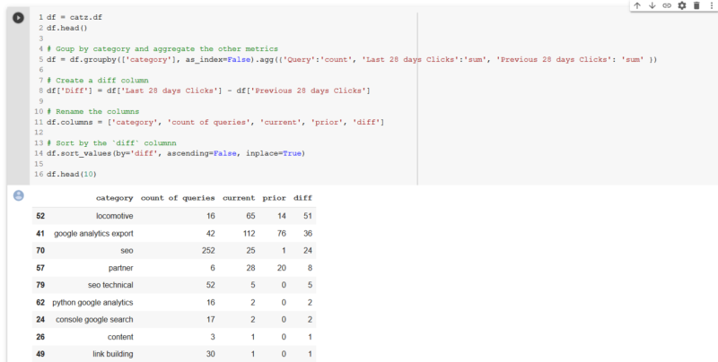
One of the frequent questions asked by clients and other stakeholders is “what happened last <insert time period here>?” With a bit of Pandas magic and the data we have already processed, to this point, we can easily compare the clicks for the two periods in our dataset, by category, and provide a column that shows the difference (or you could do % change if you like) between the two periods.

Since we just launched a new domain at the end of 2019, locomotive.agency, it is no wonder that most of the categories show click growth comparing the two periods. It is also good to see that our new brand, “Locomotive”, shows the most growth. We also see that an article that we did on Google Analytics Exports, has 42 queries, and a growth of 36 monthly clicks.
This is helpful, but it would be cool to see if there are semantic relationships between query categories that we did better, or worse. Do we need to build more topical relevance around certain categories of topics?
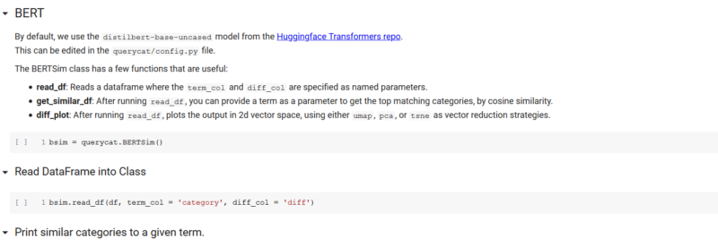
In the shared code, we made for easy access to BERT, via the excellent Huggingface Transformers library, simply by including the querycat.BERTSim class in your code. We won’t cover BERT in detail, because Dawn Anderson, has done an excellent job here.

This class allows you to input any Pandas DataFrame with a terms (queries) column, and it will load DistilBERT, and process the terms into their corresponding summed embeddings. The embeddings, essentially are vectors of numbers that hold the meanings the model as “learned” about the various terms. After running the read_df method of querycat.BERTSim, the terms and embeddings are stored in the terms (bsim.terms) and embeddings(bsim.embeddings) properties, respectively.
Similarity
Since we are operating in vector space with the embeddings, this means we can use Cosine Similarity to calculate the cosine of the angles between the vectors to measure the similarity. We provided a simple function here, that would be helpful for sites that may have hundreds to thousands of categories. “get_similar_df” takes a string as the only parameter, and returns the categories that are most similar to that term, with a similarity score from 0 to 1. You can see below, that for the given term “train,” locomotive, our brand, was the closest category, with a similarity of 85%.

Plotting Change
Going back to our original dataset, to this point, we now have a dataset with queries and PoP change. We have run the queries through our BERTSim class, so that class knows the terms and embeddings from our dataset. Now we can use the wonderful matplotlib, to bring the data to life in an interesting way.
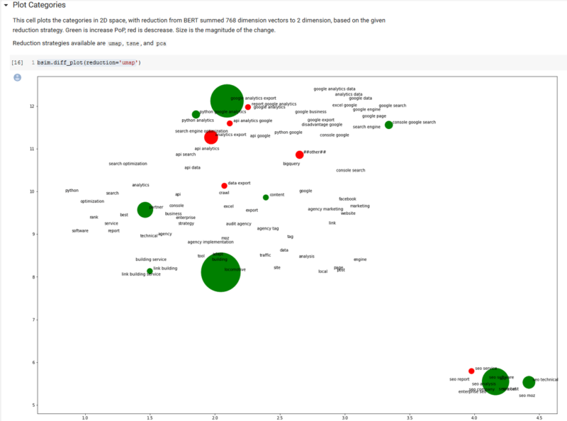
Calling a class method, called diff_plot, we can plot a view of our categories in two-dimensional, semantic space, with click change information included in the color (green is growth) and size (magnitude of change) of the bubbles.

We included three separate dimension reduction strategies (algorithms), that take the 768 dimensions of BERT embeddings down to two dimensions. The algorithms are “tsne,” “pca” and “umap.” We will leave it to the reader to investigate these algorithms, but “umap” has a good mixture of quality and efficiency.
It is difficult to see (because ours is a relatively new site) much information from the plot, other than an opportunity to cover the Google Analytics API in more depth. Also, this would be a more informative plot had we removed zero change, but we wanted to show how this plot semantically clusters topic categories in a meaningful way.
Wrapping Up
In this article, we:
- Introduced the Apriori algorithm.
- Showed how you could use Apriori to quickly categorize a thousand queries from GSC.
- Showed how to use the categories to aggregate PoP click data by category.
- Provided a method for using BERT embeddings to find semantically related categories.
- Finally, displayed a plot of the final data showing growth and decline by semantic category positioning.
We have provided all code as open source with the hopes that others will play and extend the capabilities as well as write more articles showing other ways various algorithms, new and old, can be helpful for making sense of the data all around us.
The post Using the Apriori algorithm and BERT embeddings to visualize change in search console rankings appeared first on Search Engine Land.
source https://searchengineland.com/using-the-apriori-algorithm-and-bert-embeddings-to-visualize-change-in-search-console-rankings-328702


1 Comments
Very shortly this site will be famous among all blogging users, due to it’s pleasant articles.
ReplyDeleteOracle sql plsql online training
Oracle sql plsql training
Oracle Web logic online training
Oracle Web logic training
OSB online training
OSB training
OTM online training
OTM training
SAS online training
SAS training
structs online training